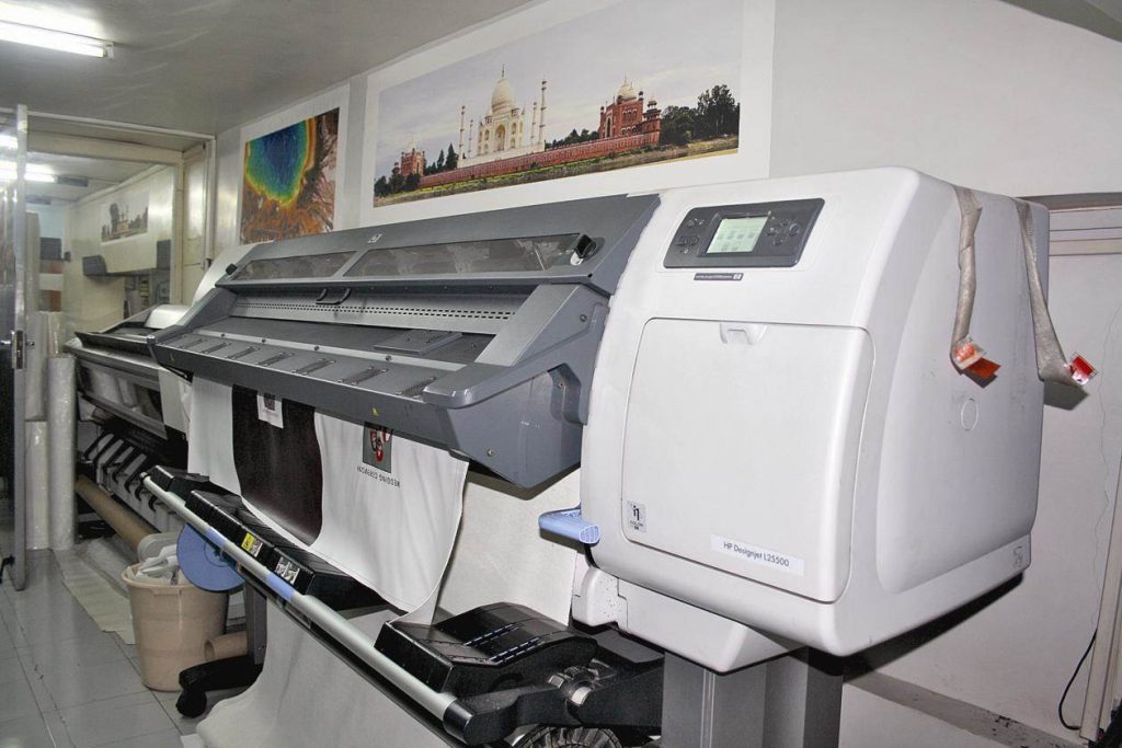
Banners are one of the most effective and affordable tools for brand visibility. Whether you’re promoting an event, showcasing a product, or advertising a business, your banner serves as your first impression. However, even minor mistakes in design or printing can drastically reduce its impact. If you want professional, eye-catching results, it’s essential to understand what not to do. Leading services like Doculand banner printing deliver exceptional quality, but success also depends on how well you prepare your design files and specifications.
Here are the most common banner printing mistakes—and how to avoid them.
1. Using Low-Resolution Images
One of the most frequent mistakes is submitting images that look sharp on-screen but turn blurry when printed. Banners are large-format prints, so digital images must have high resolution.
Avoid it by:
- Ensuring all images are at least 150–300 DPI at full print size.
- Using vector graphics for logos and text whenever possible.
- Avoiding screenshots or web images, which lose clarity when scaled.
2. Ignoring the Safe Zone and Bleed Area
Designers often forget to account for bleed (the extra edge around your design) and safe zones (the area away from trimming). As a result, important text or logos may get cut off.
Avoid it by:
- Adding 0.25 to 0.5 inches of bleed around all edges.
- Keeping essential elements—logos, text, faces—at least 1 inch away from the edge.
- Using Doculand’s provided templates or dimension guides to ensure proper file setup.
Proper layout preparation ensures your banner looks balanced and complete after trimming.
3. Choosing the Wrong Material
Different environments demand different materials. Using indoor vinyl outdoors or lightweight fabric in windy areas can lead to tears or fading.
Avoid it by:
- Selecting weather-resistant vinyl for outdoor banners.
- Choosing mesh banners for high-wind areas.
- Opting for fabric or polyester banners for indoor displays.
Doculand offers material recommendations based on your banner’s location, ensuring durability and vibrant color retention.
4. Poor Font Choices and Small Text Sizes
Fancy fonts may look appealing on a computer but become unreadable from a distance. Clarity always trumps creativity when it comes to banners.
Avoid it by:
- Using bold, sans-serif fonts for maximum legibility.
- Maintaining a minimum text height of 4 inches for large banners.
- Limiting the number of fonts to two for a clean, professional look.
5. Weak Color Contrast
Low contrast between text and background colors reduces visibility—especially outdoors where lighting conditions vary.
Avoid it by:
- Using dark text on light backgrounds or vice versa.
- Testing colors under different lighting (daylight, indoor, artificial).
- Sticking with brand colors but adjusting saturation for stronger contrast.
Professionally calibrated printers at Doculand ensure color accuracy, but your design contrast determines how well the message pops.
6. Overloading the Design with Text
A banner is not a brochure—too much information overwhelms viewers and dilutes your message.
Avoid it by:
- Keeping content concise: headline, subline, and call-to-action.
- Using bullet points or short phrases.
- Ensuring at least 40–50% white space for visual breathing room.
Remember: simplicity attracts attention; clutter loses it.
7. Not Checking File Format or Color Mode
Submitting files in the wrong format or color profile often leads to printing errors or color distortion.
Avoid it by:
- Exporting files in PDF, AI, EPS, or TIFF for best print compatibility.
- Setting color mode to CMYK, not RGB, for accurate print colors.
- Embedding all fonts and images to prevent layout issues.
Doculand’s prepress team reviews all files for format and color consistency before printing, helping eliminate these technical mishaps.
8. Skipping Proofing and Test Prints
Skipping a proof is the quickest way to end up with costly reprints. Proofing ensures your layout, colors, and alignment appear exactly as intended.
Avoid it by:
- Always requesting a digital or physical proof before final printing.
- Double-checking spelling, contact details, and alignment.
- Confirming banner size and orientation before approval.
A few extra minutes spent proofing can save hours of frustration later.
9. Overlooking Installation Requirements
A flawless print can still fail if the installation setup isn’t considered. Poorly placed grommets, missing pole pockets, or incorrect hanging tools can damage the banner.
Avoid it by:
- Informing your printer how the banner will be displayed (hung, mounted, or stretched).
- Requesting reinforced edges and metal grommets for outdoor banners.
- Checking that mounting hardware fits the banner’s size and weight.
Doculand offers custom finishing options like reinforced hems, wind slits, and mounting accessories to ensure stability and ease of installation.
10. Not Accounting for Viewing Distance
Designs that look great up close can appear cluttered or unreadable from a distance.
Avoid it by:
- Adjusting font size and image proportions for long-range visibility.
- Ensuring your message is readable from at least 10–20 feet away.
- Keeping focal points centered and uncluttered.
Professional banner designers use scaling tools to test how graphics appear at various distances—an essential step before final print.
Final Thoughts
A professionally printed banner can attract thousands of eyes—but only if designed and prepared correctly. Avoiding common pitfalls like low-resolution images, poor font choices, or wrong materials will save you time, money, and frustration.

